
Why Responsive Web Design Is Non-Negotiable (with WordPress Tips)
Let’s set the scene: You’re browsing on your phone, but the website you land on has tiny, unreadable text, buttons too small to tap, and it’s painfully slow to load. Frustrating, isn’t it? That’s exactly how potential customers feel when they encounter a site that doesn’t prioritize mobile users.
With over 55% of global web traffic coming from mobile devices, mobile-first design isn’t just a recommendation; it’s a necessity. If your site isn’t optimized for mobile, you’re leaving traffic, leads, and conversions on the table. Thankfully, WordPress provides powerful tools to make mobile-first design achievable.
Mobile-first design flips the traditional web design approach. Instead of designing for desktops and scaling down for smaller screens, you start with mobile layouts and scale up. This approach ensures a smooth, fast, and user-friendly experience for mobile users from the get-go.
On WordPress, mobile-first design is easier than ever with responsive themes, plugins, and tools that cater specifically to smaller screens.
Google’s Mobile-First Indexing
Since 2019, Google has used the mobile version of websites to determine search rankings. If your site doesn’t perform well on mobile, your SEO takes a hit. WordPress makes it easy to stay compliant with mobile-first indexing using themes like GeneratePress, Astra, or Divi—all optimized for responsiveness.
User Behavior on Mobile
Research shows 53% of mobile users will leave a site if it takes longer than 3 seconds to load. This means your site not only has to look good but also perform flawlessly. Using WordPress plugins like WP Rocket or Autoptimize can boost loading speed and user satisfaction.
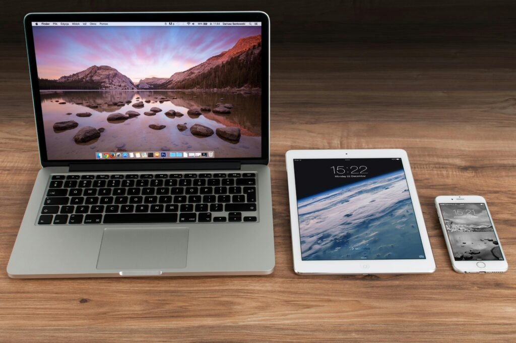
Cross-Device Consistency
A responsive website ensures your site looks and feels consistent across all devices, whether it’s a smartphone, tablet, or desktop. This consistency builds trust and keeps users engaged.
WordPress Tips for Mobile-First Design
1. Start with a Mobile-Friendly Theme
Choosing the right WordPress theme is crucial. Look for lightweight, mobile-optimized themes like Neve, OceanWP, or Kadence. These themes are designed to adapt seamlessly across devices and are highly customizable.
2. Use Page Builders for Responsive Layouts
WordPress page builders like Elementor and Beaver Builder allow you to tweak layouts specifically for mobile. For example, you can adjust font sizes, margins, and button placements for better usability on smaller screens.
3. Optimize for Speed
- Image Optimization: Compress images with tools like Imagify or Smush.
- Lazy Loading: Delay the loading of images and videos until they appear in the user’s viewport using WordPress’s built-in lazy loading or plugins.
- Caching Plugins: Use tools like WP Super Cache or LiteSpeed Cache to serve faster-loading pages.
- CDN Integration: Implement a Content Delivery Network (CDN) via services like Cloudflare to deliver content quickly worldwide.
4. Test with WordPress Customizer
The WordPress Customizer lets you preview your site on mobile, tablet, and desktop views. Use this tool to ensure all elements (like text, buttons, and images) look great and function well on smaller screens.
5. Clickable CTAs
Ensure Call-to-Action buttons are large enough for mobile users to tap comfortably. Use WordPress plugins like Elementor to create buttons that stand out visually and are easy to interact with.
6. Leverage Mobile-Specific Plugins
Plugins like WP Mobile Menu create touch-friendly, mobile-optimized menus. Similarly, AMP for WP generates fast-loading mobile pages using Google’s AMP framework.
Analytics and Testing: Refining Your Mobile Strategy
- Google Analytics: Monitor your mobile traffic, bounce rates, and session durations to identify pain points.
- Responsive Testing Tools: Tools like BrowserStack or Responsive Viewer (a browser extension) help you test how your WordPress site looks across a variety of devices.
Regularly review and refine your site based on user data to keep it mobile-friendly.
Mobile-First Isn’t a Trend—It’s the Future
Embracing mobile-first design means meeting your audience where they are—on their phones. A mobile-first approach not only enhances user experience but also future-proofs your site in an increasingly mobile-dependent world.
With WordPress, the tools to create a responsive, mobile-first site are readily available. Whether you’re selecting the perfect theme, optimizing for speed, or designing user-friendly layouts, the power is at your fingertips.
So, is your website mobile-first yet? If not, it’s time to roll up your sleeves and make the shift. Your users—and your bottom line—will thank you. 🚀